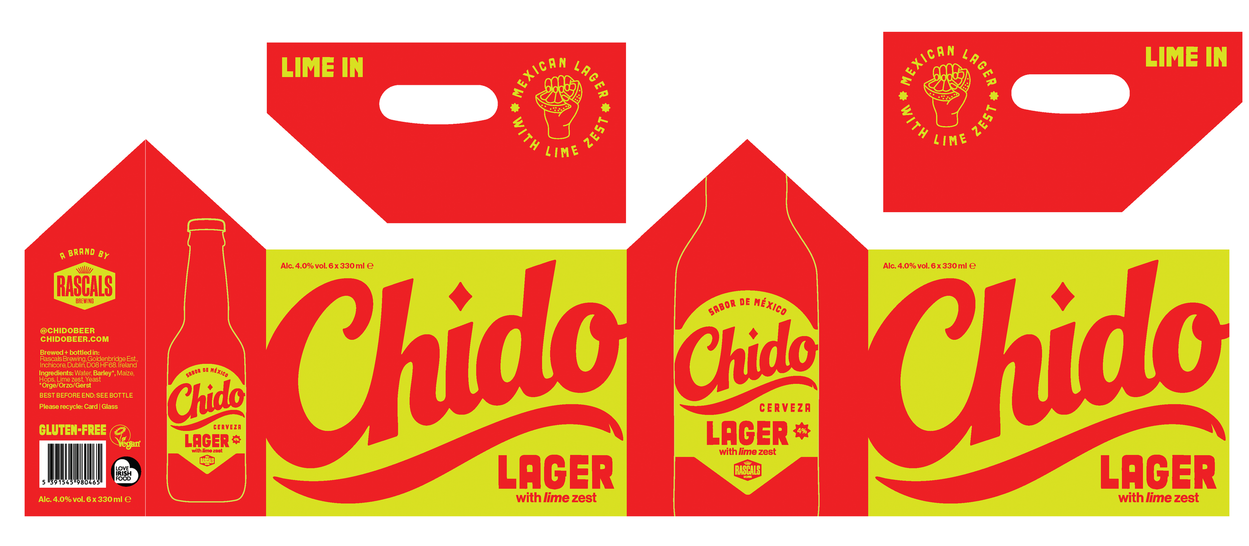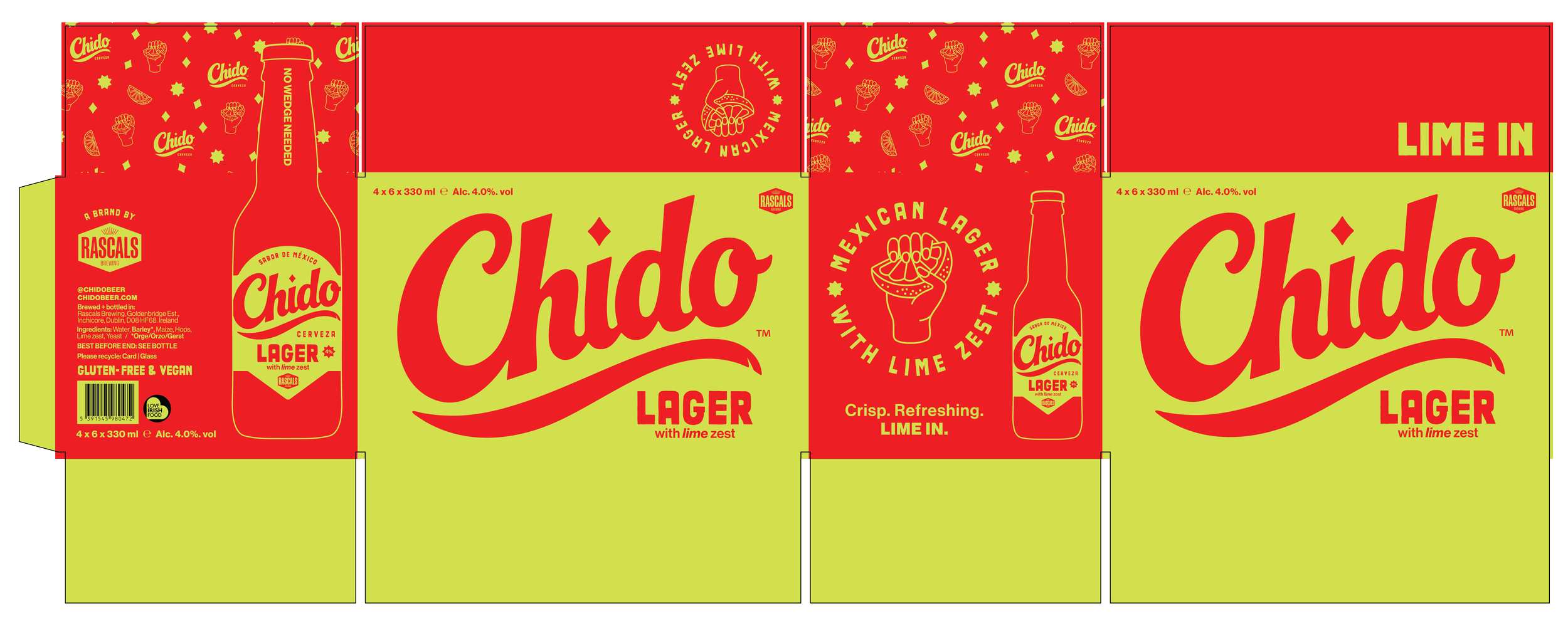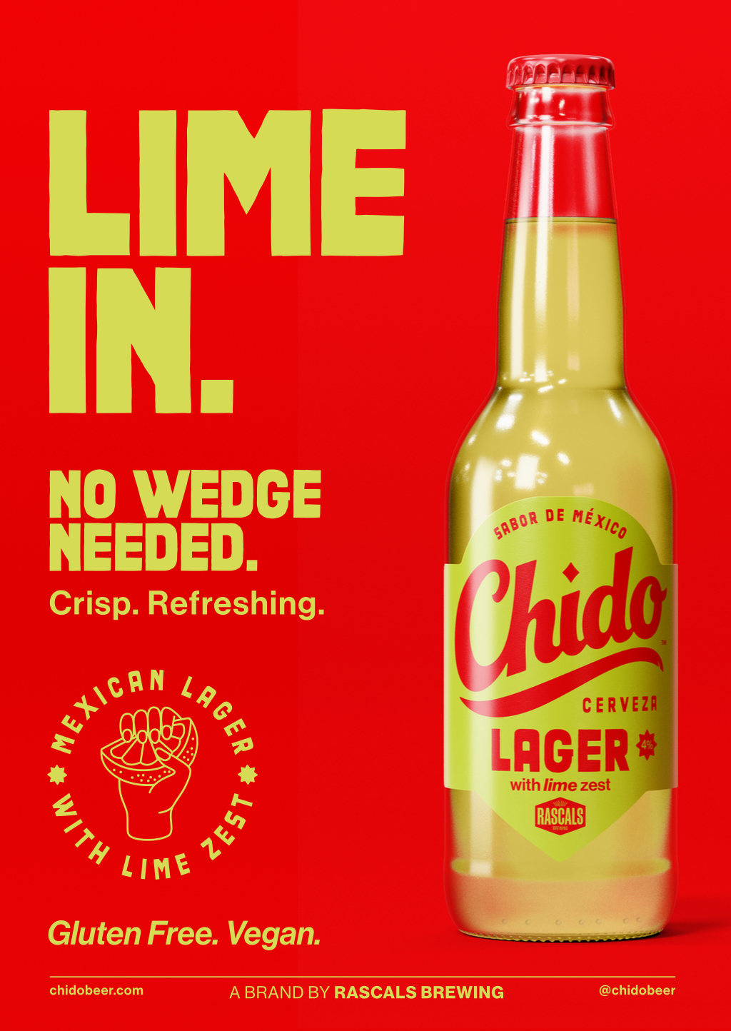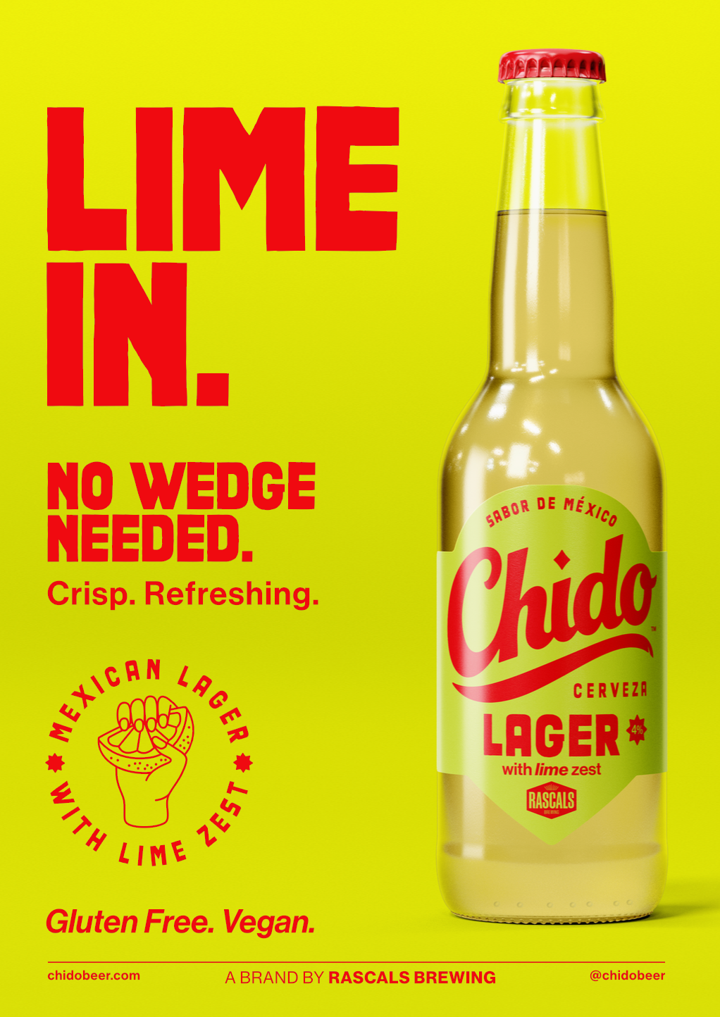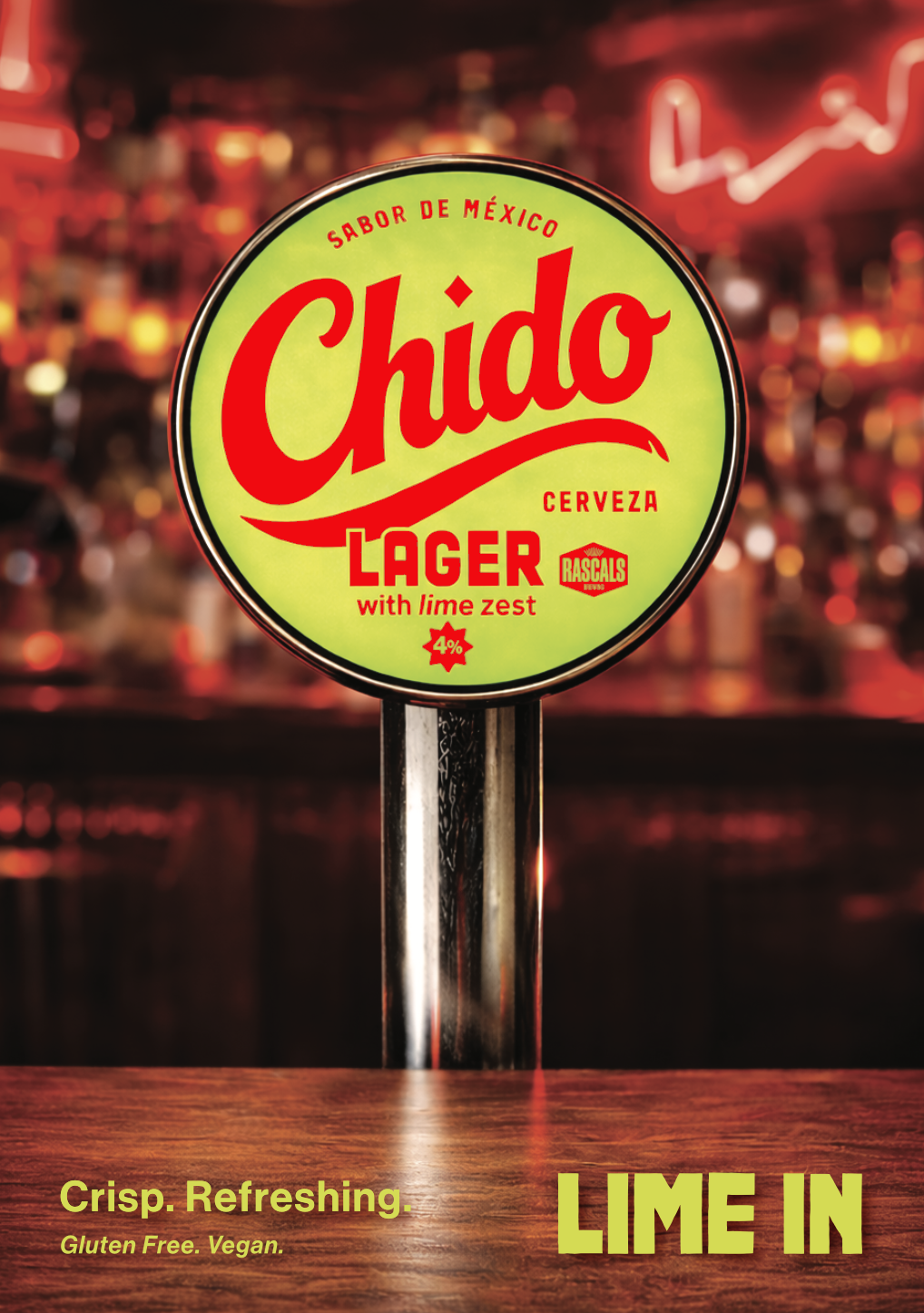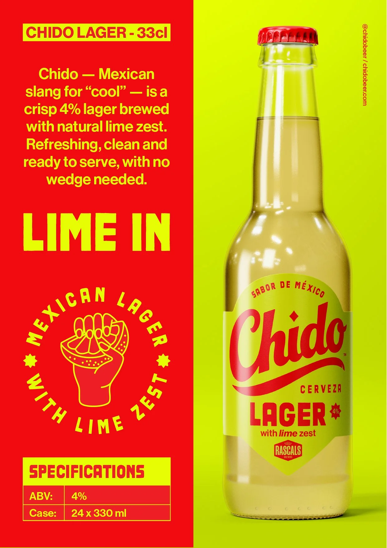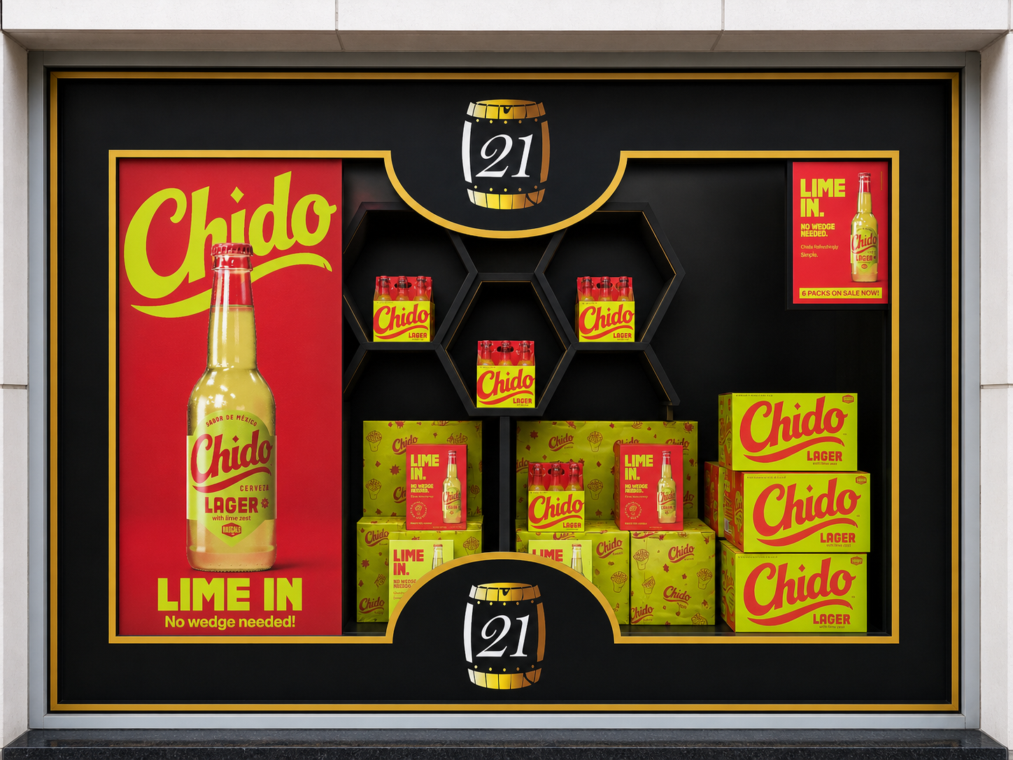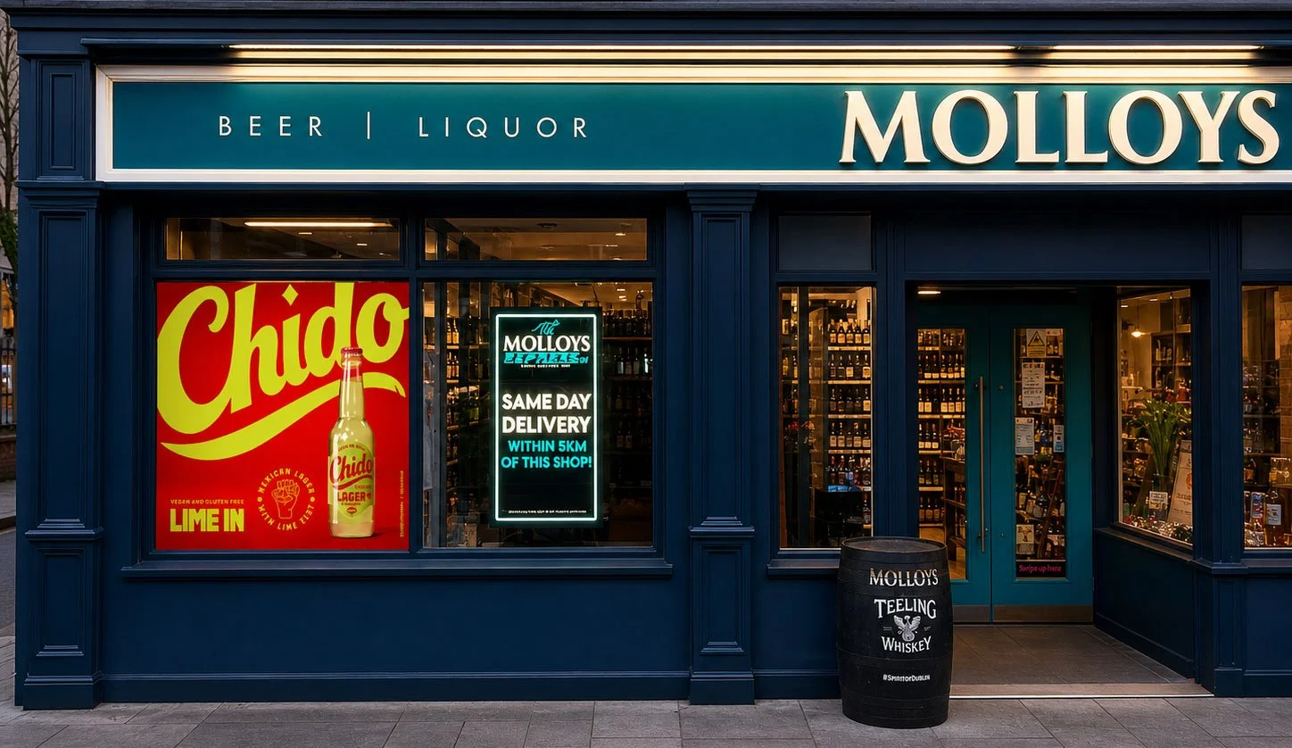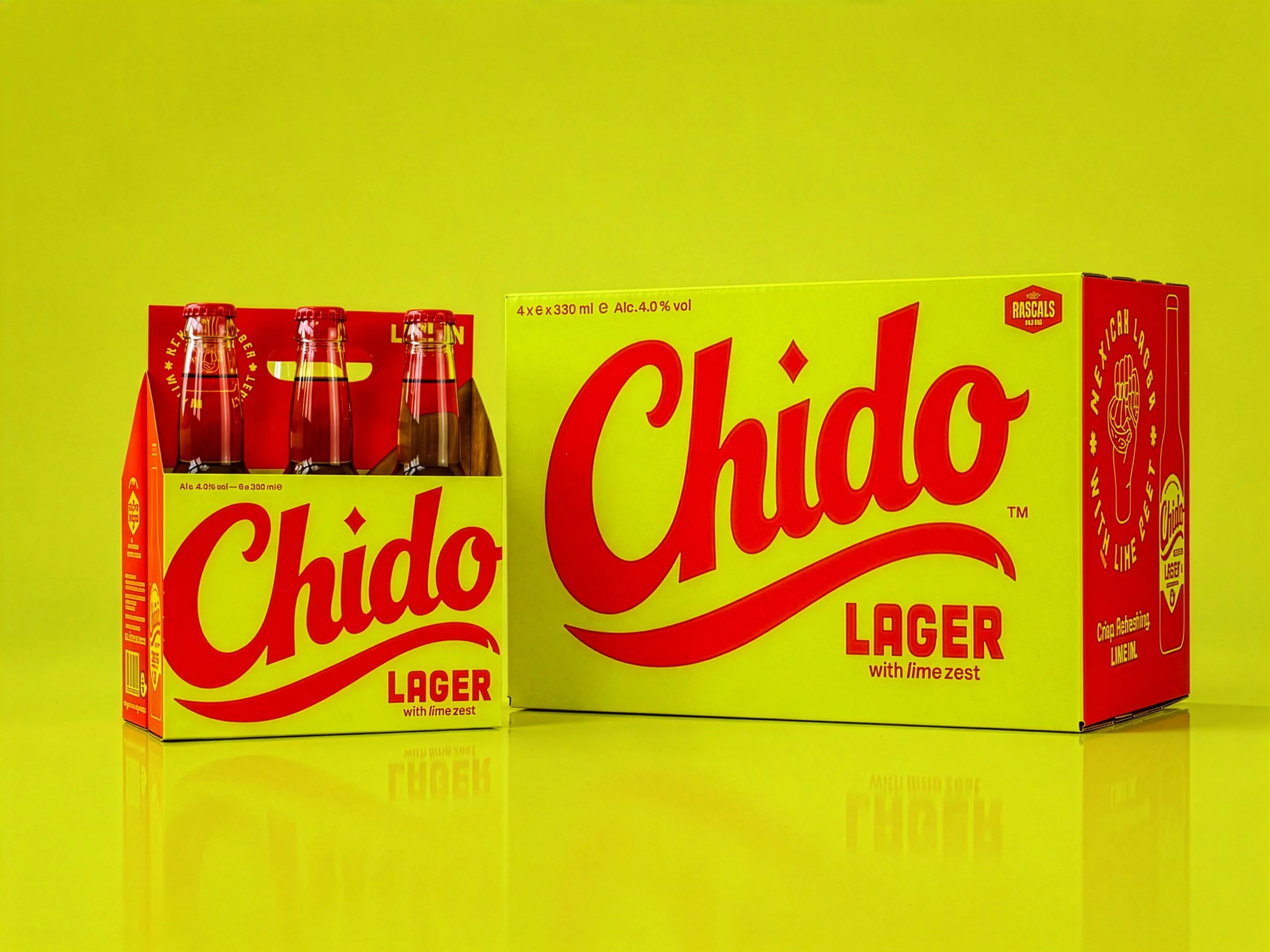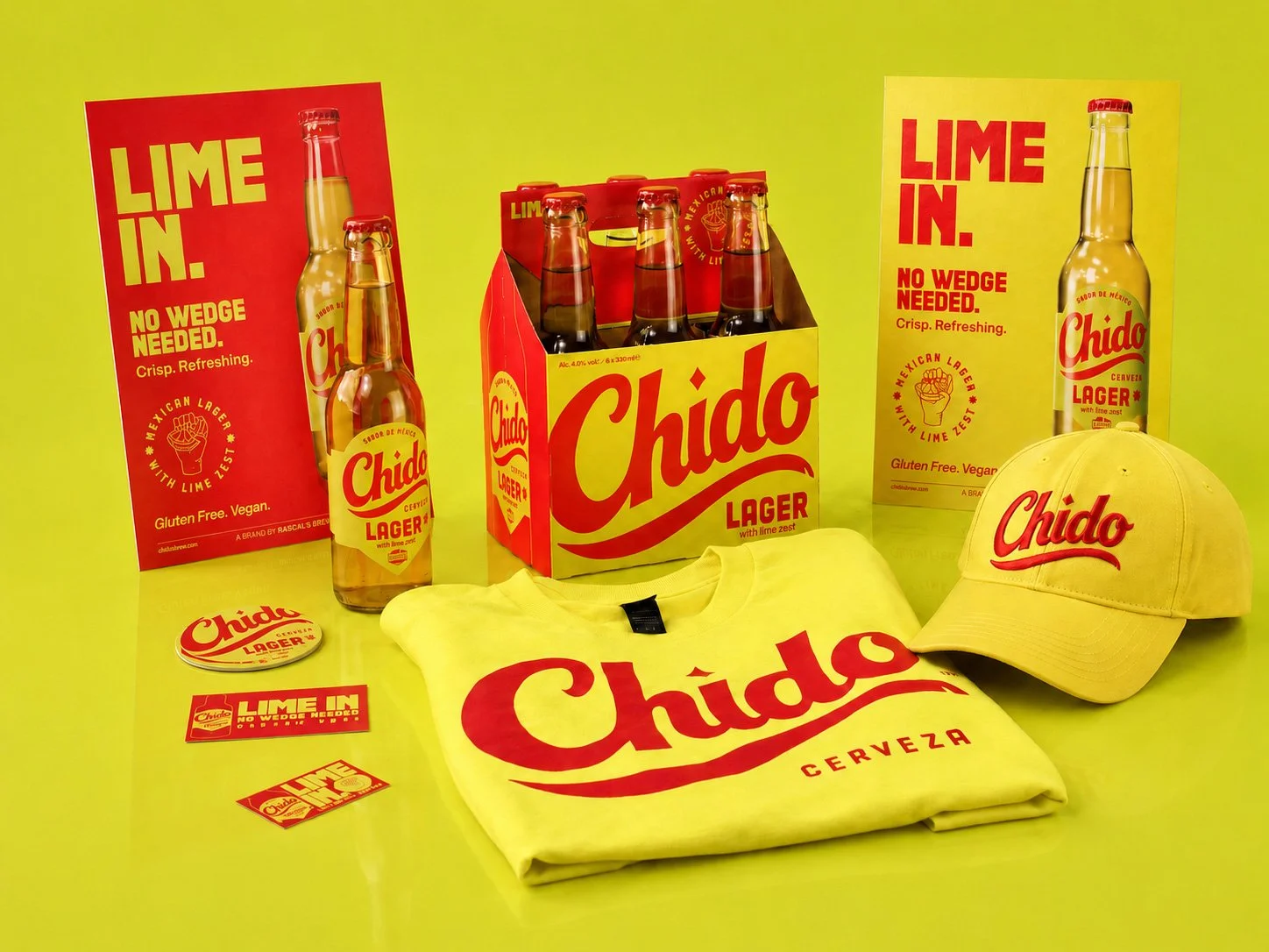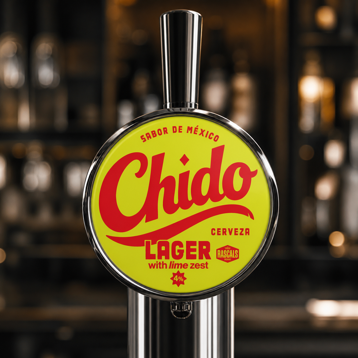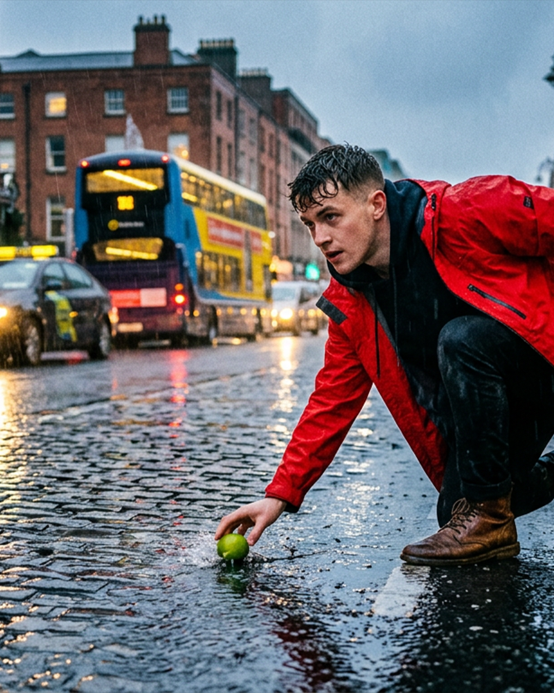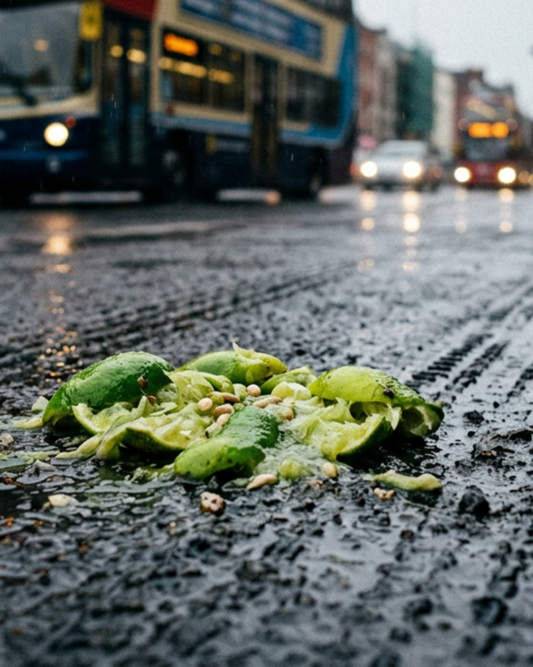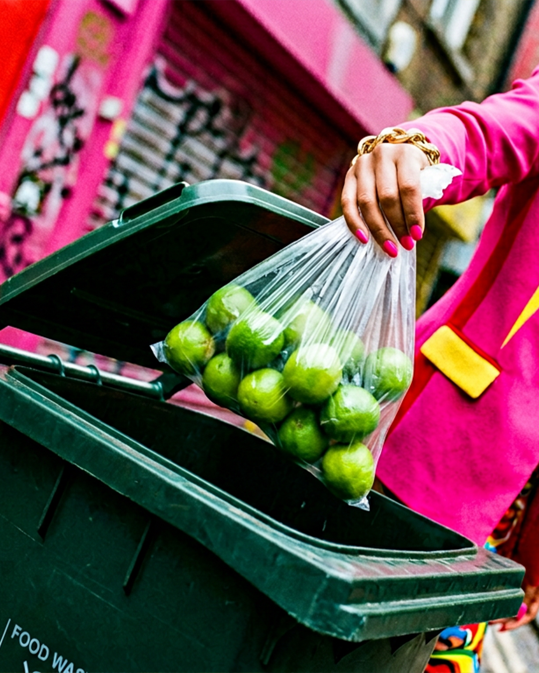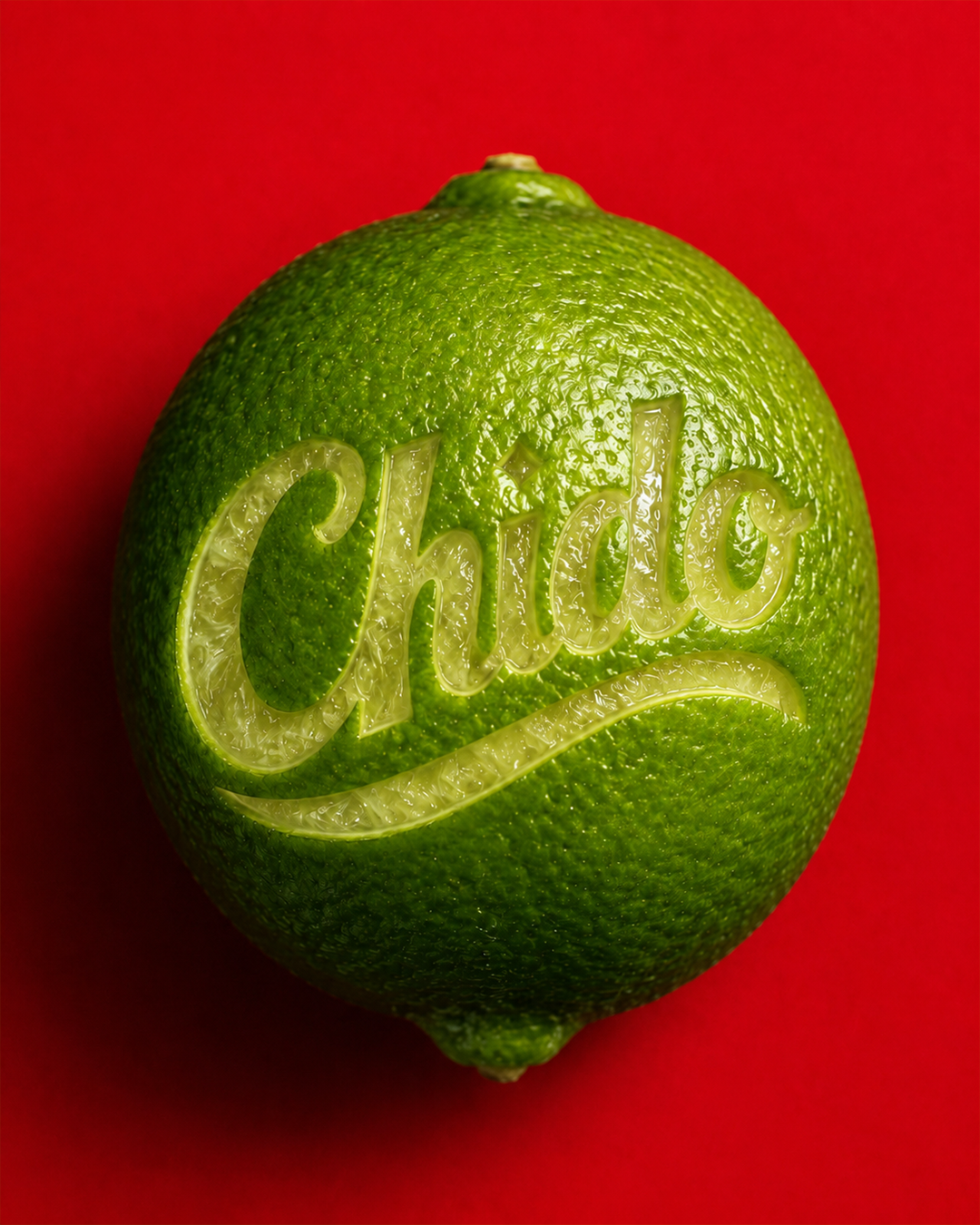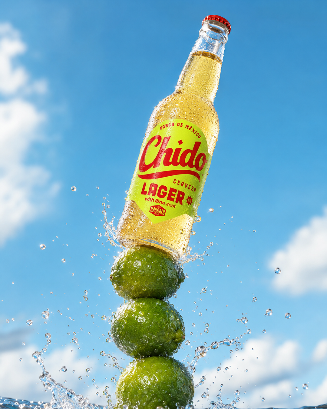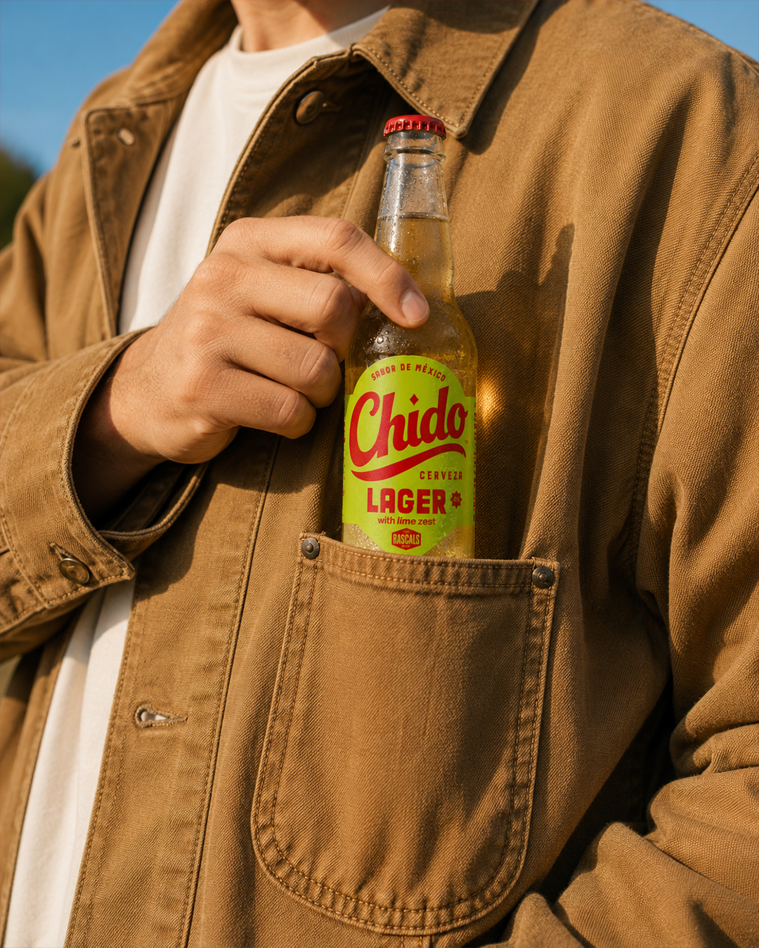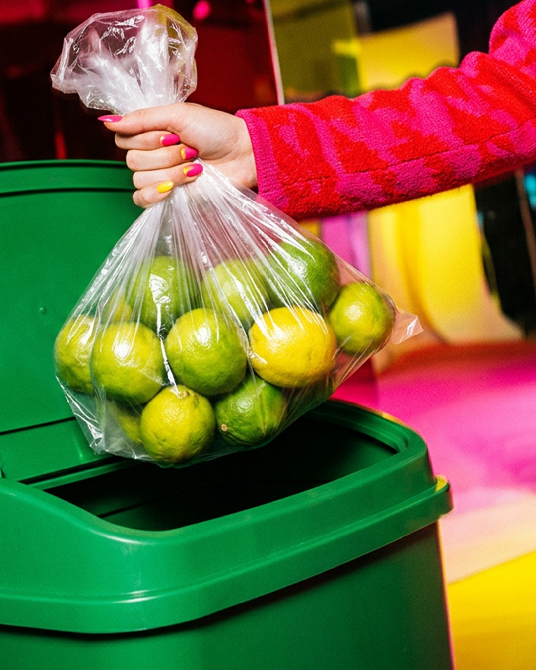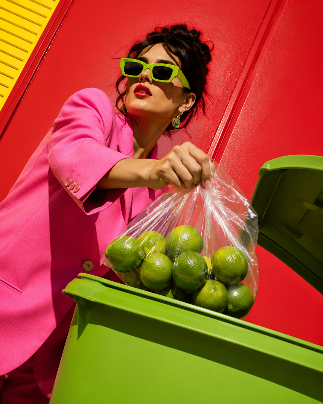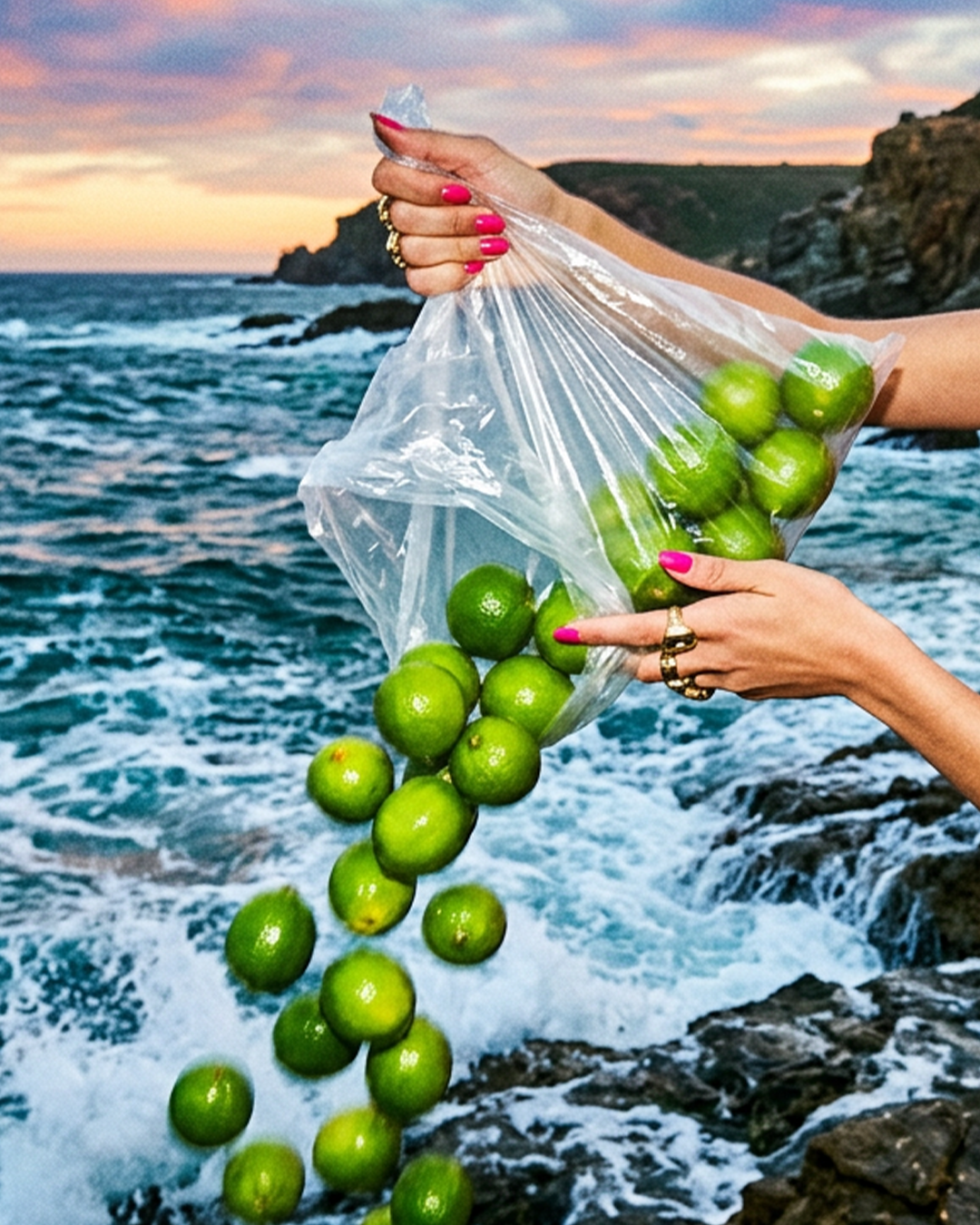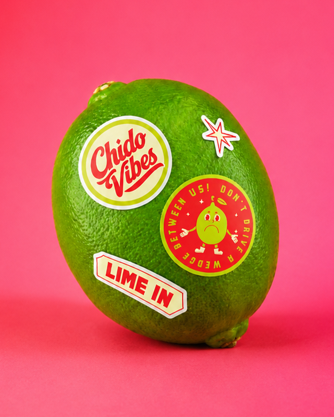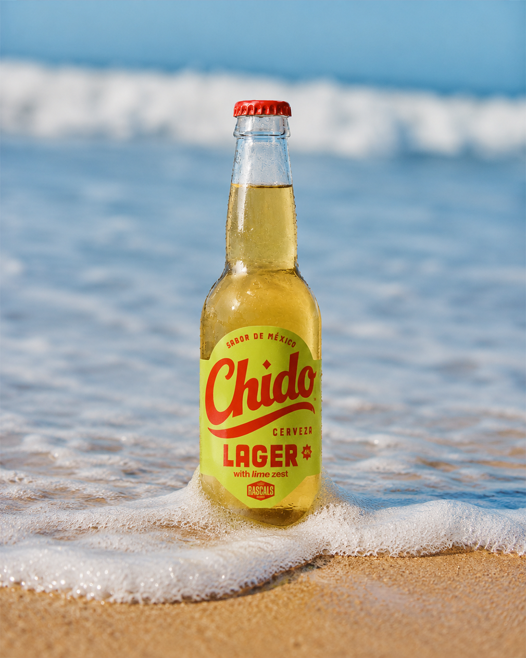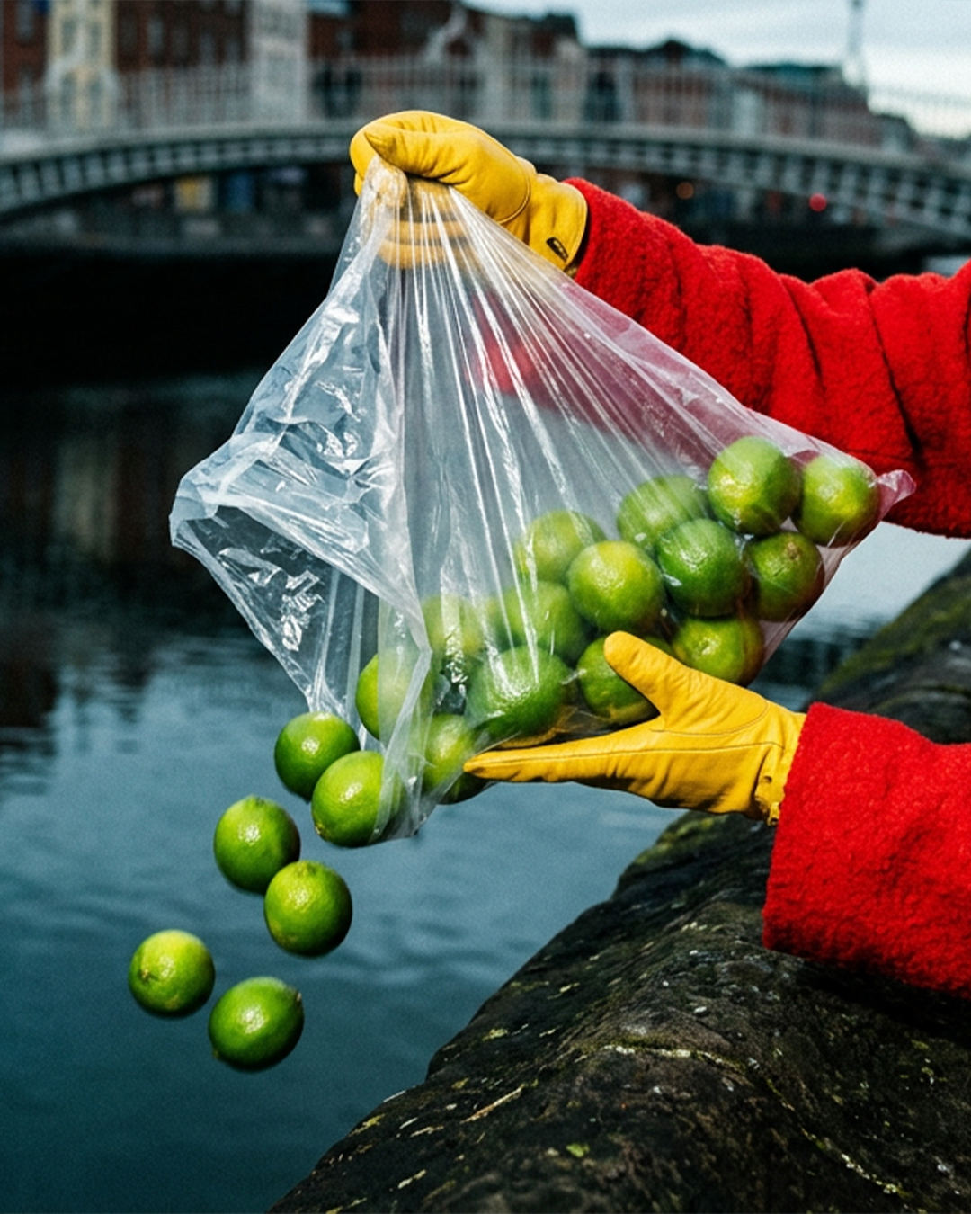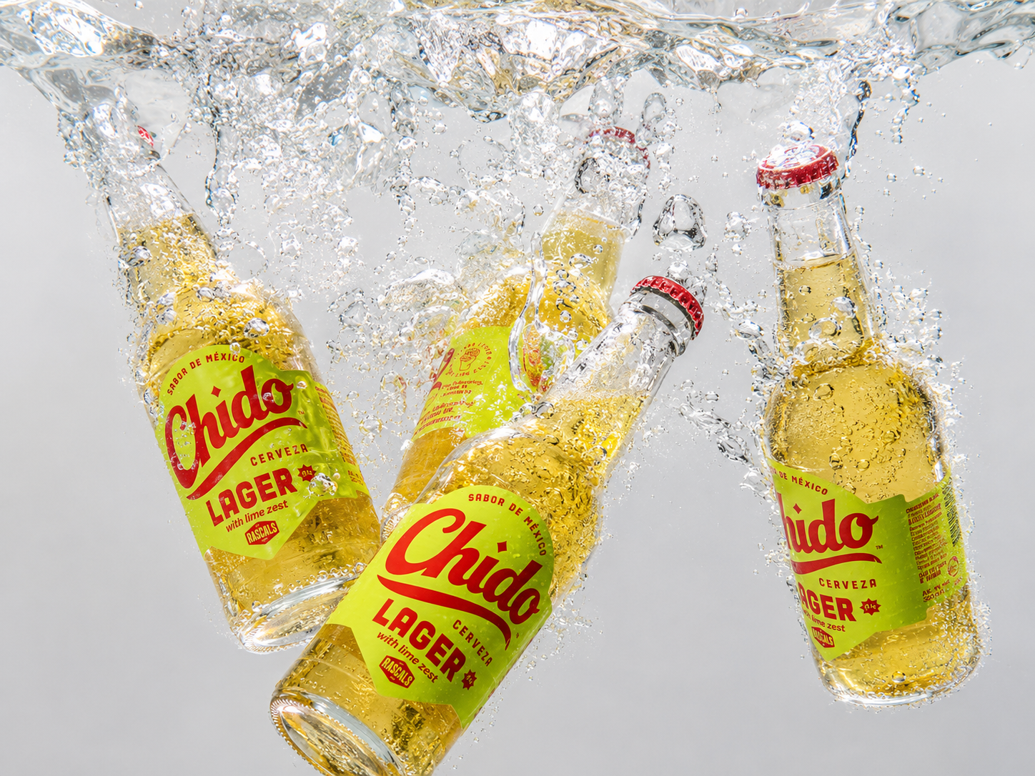
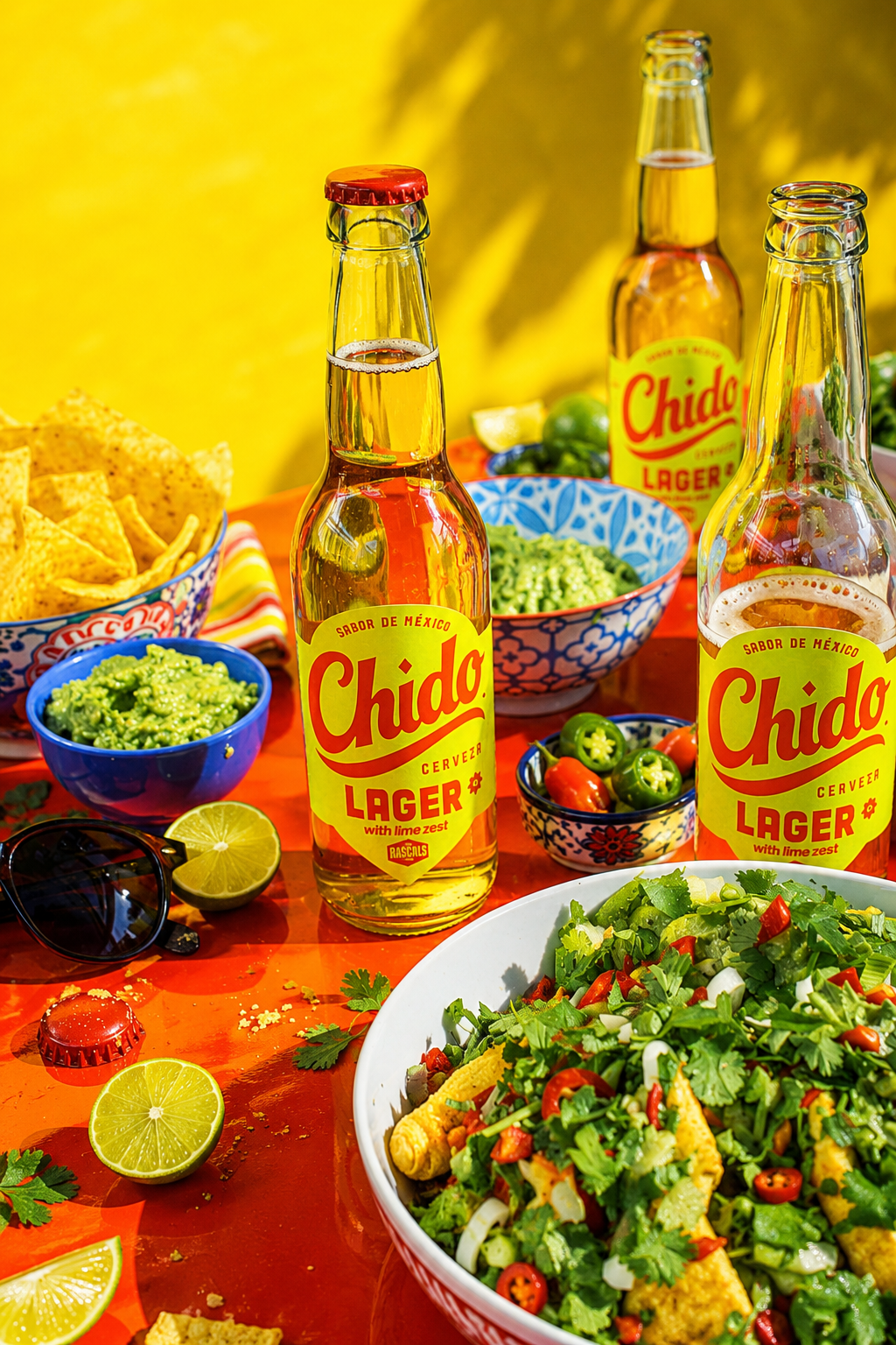
CHIDO - LIME IN
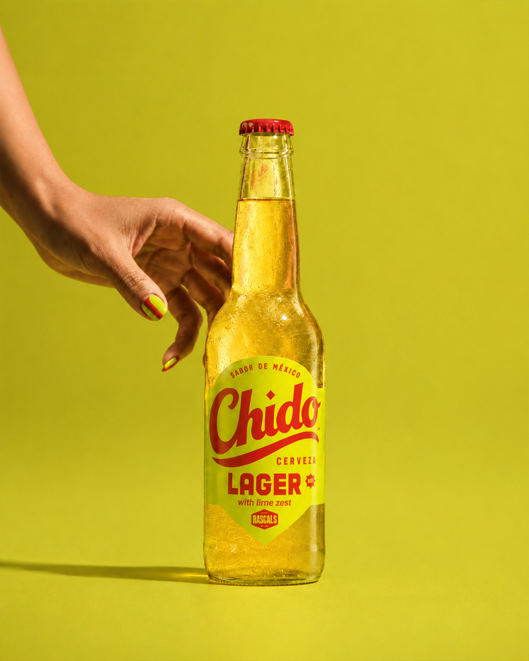
CHIDO is a modern Mexican lager with real lime zest, built for social, easy-going moments.
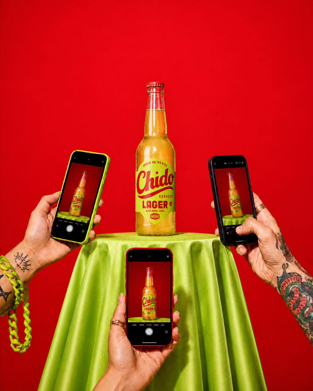
I created the full branding suite from the ground up including the brand foundations, positioning, concept, visual identity and brand guidelines centred around the core idea “LIME IN.”
The result is a confident, playful brand designed for pubs, pre-drinks and everyday social moments.


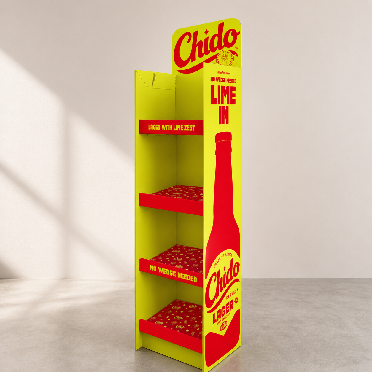
The Concept
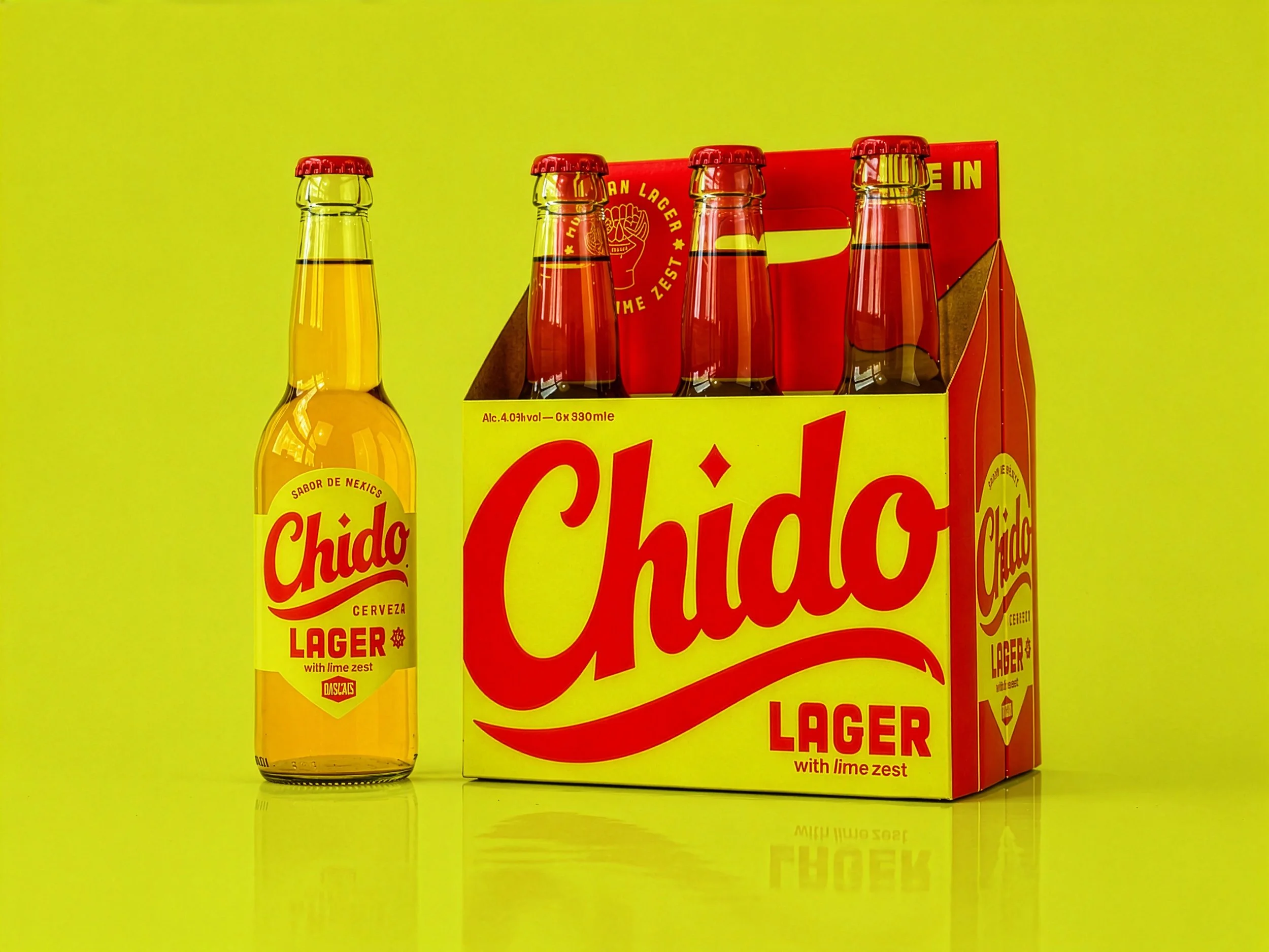
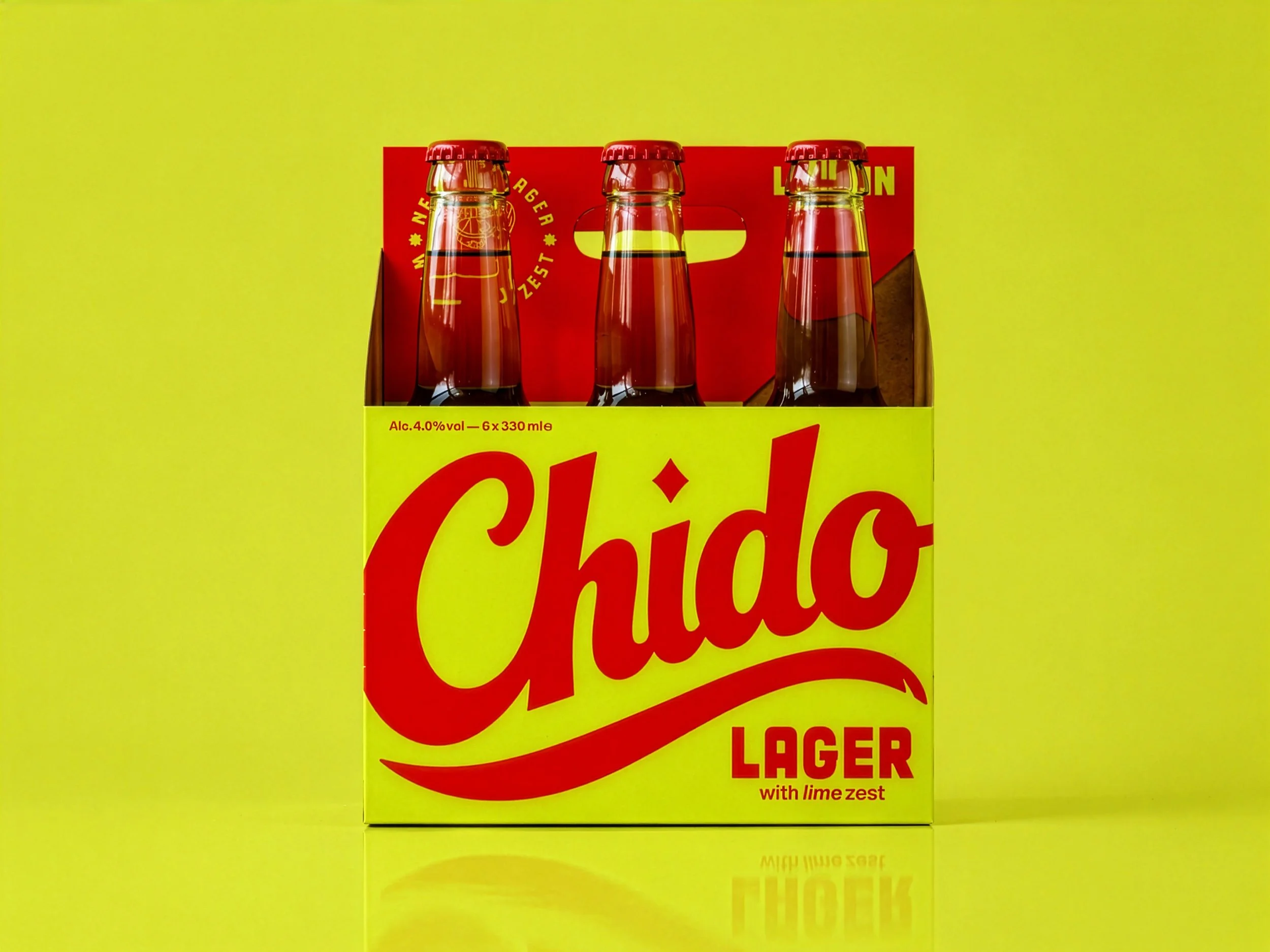
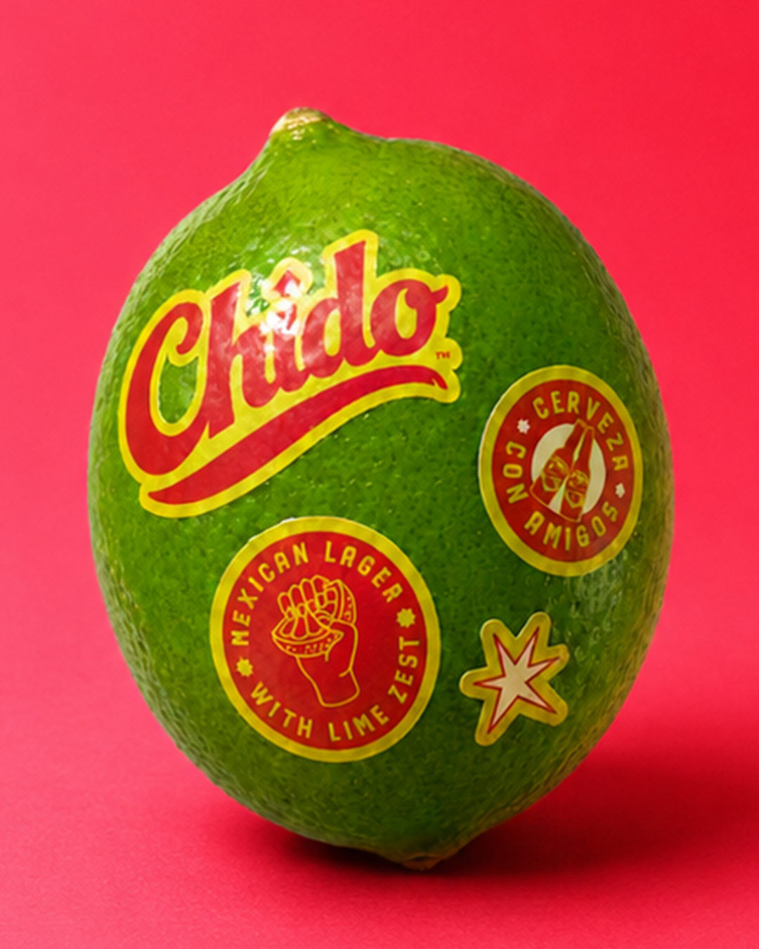
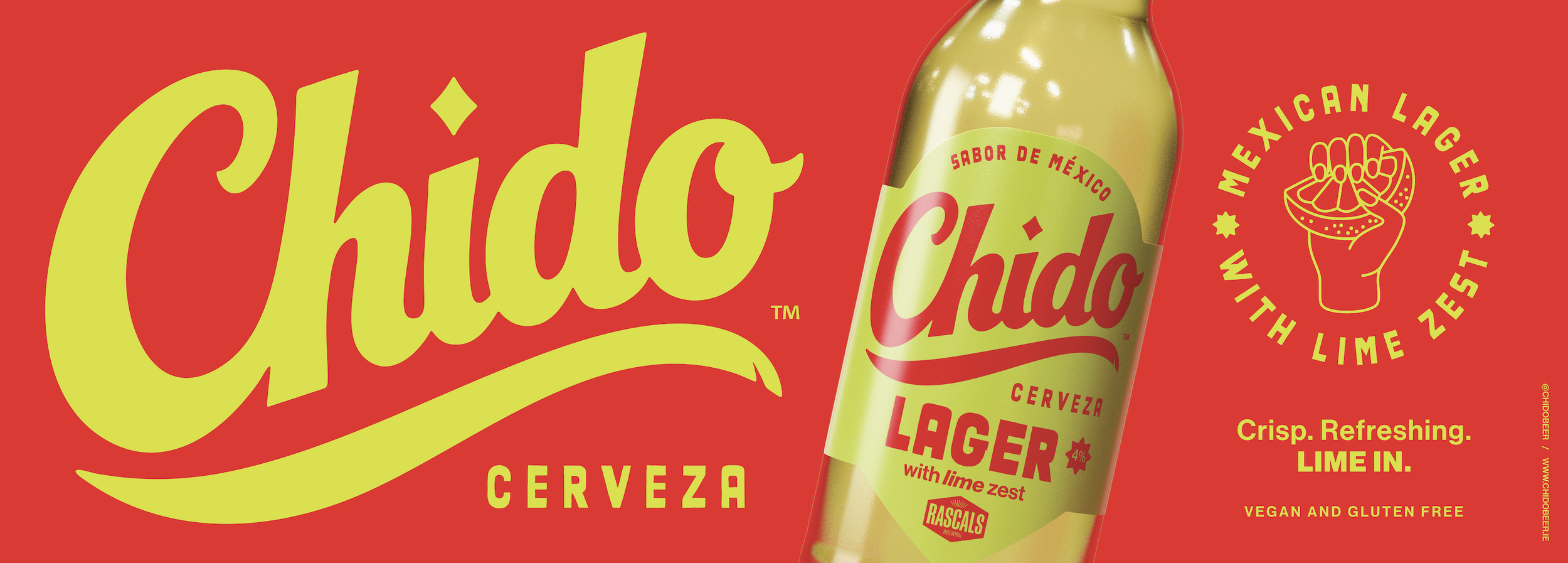
CHIDO takes inspiration from traditional Mexican sign-painting, bold, confident and made to stand out. We stripped the style back to its essentials to create something modern and clean.
The small chip in the swoosh is a subtle nod to hand-painted wooden signs. A touch of craft and character in an otherwise minimal mark.
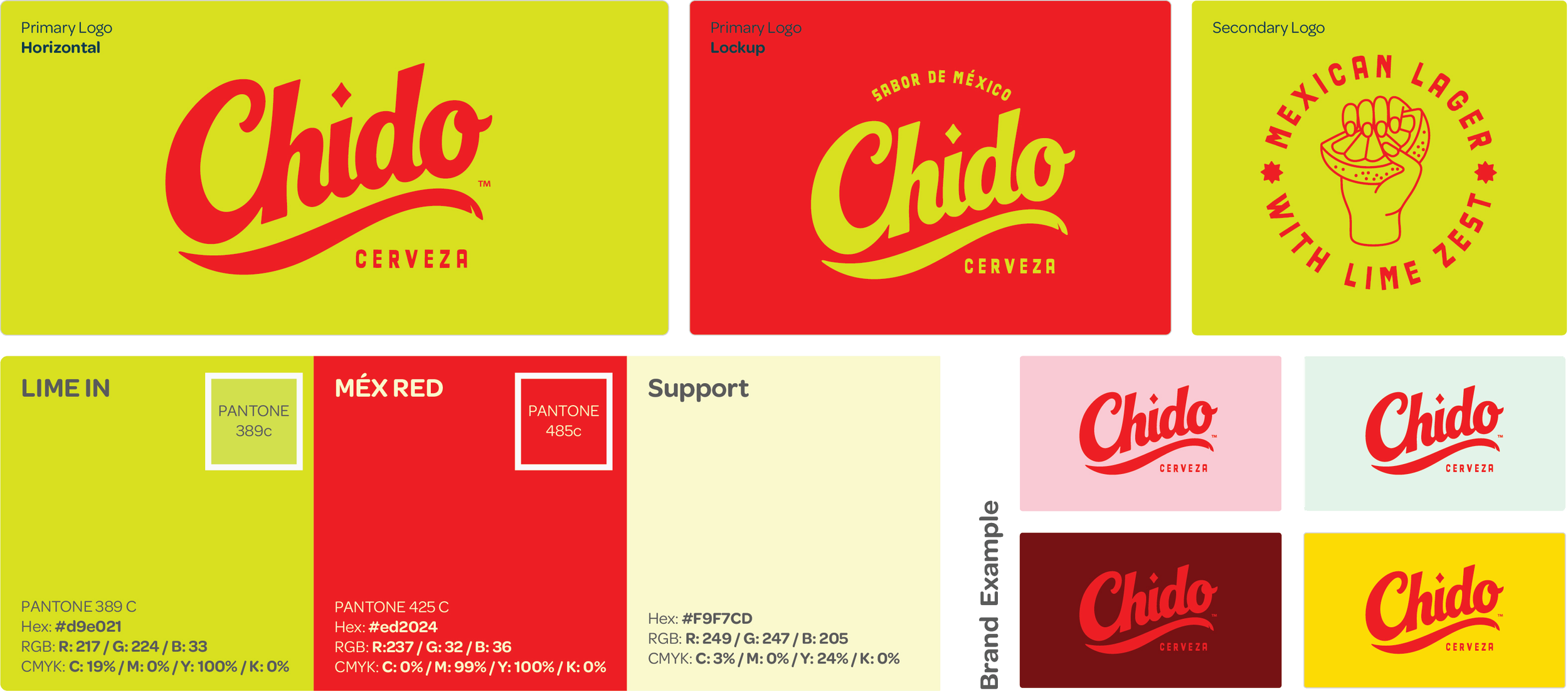
Colours
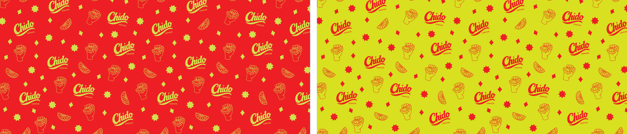
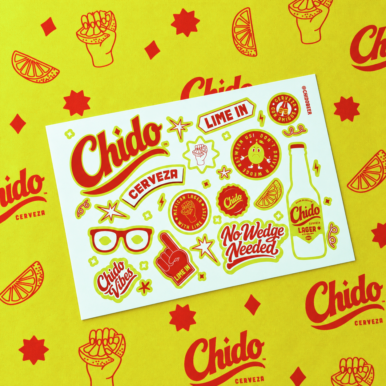
Pattern
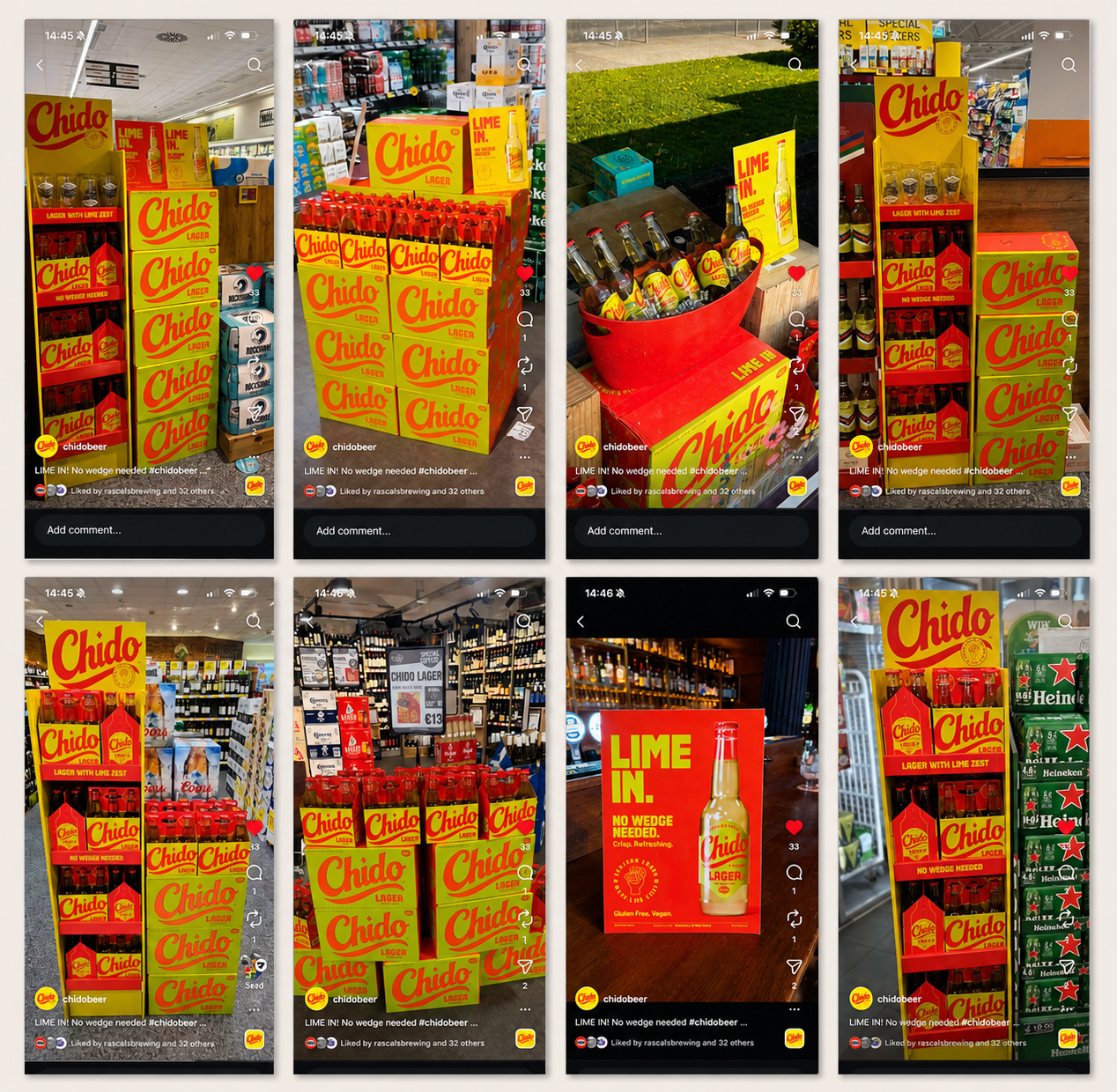
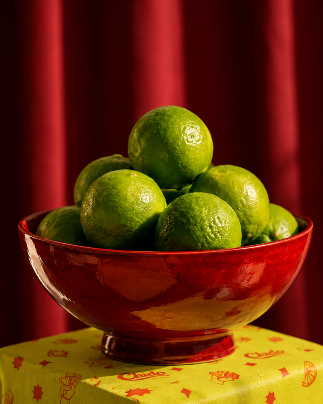
CHIDO mainly uses red and green to keep things bold and recognisable. The colours draw from Mexican sign-painting and street culture, while the limited palette keeps the brand clean, modern, and easy to use everywhere. Red leads the identity and can be paired with additional colours in future, allowing the brand to scale while staying consistent.
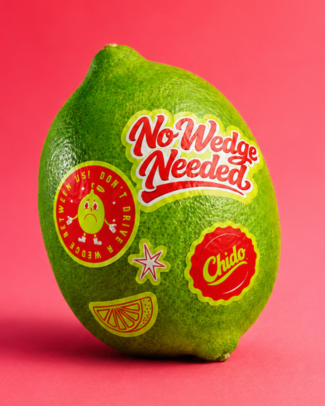
The CHIDO pattern extends the brand beyond the logo. It adds energy, builds recognition and creates a flexible system that can be used across packaging, digital and environments while staying consistent.